Three out of the four characters have been updated! Clearly their costumes & color palette differs from the rough mess of a doodle posted above. Eve will be next when I have the time to work on her. Also just realized that I've been fairly active on my blog lately...Hopefully I can keep posting regularly unlike last year...
Tuesday, March 31, 2015
Mihal 2013 - 2015
~Mihal has been streamlined a bit, so no more insane ab lines.
~His mask is now more stylized & the gem was added to connect its design to Matei's shackles. The mask is also supposed to make him look demonic, which I think works here.
~The costume he's wearing in the 2013 design was always a prisoner look & the 2015 version is supposed to be him when he's "free"
~2013: This drawing does not have legs hence the cropping...He skipped leg day, so his legs clearly snapped off while trying to support his disproportionate torso. :)
Saturday, March 28, 2015
Mihal's Upgrade In Progress
Continuing to reboot/revamp some old characters I designed. Above is both the original design of Mihal from 2013 and then his revamped look for 2015 which is still in progress. If you snoop through this blog enough you will notice I've been teasing a redesign for these characters for a while.
Design Breakdown:
~Decided to reduce Mihal's muscle mass in the new design because...1.) My proportions were ridiculous. & 2.) The concept I setup for his character even back then just didn't fit with the hulk look.
But Mihal will still be more muscular than the other characters he'll be paired up with.
~Mihal's mask will remain fairly similar to the original with a few edits to have it match the different art style.
~Skin tone & hair color are still in flux while I deicide on his palette.
Thursday, March 26, 2015
Priya Over Five Years
This is an abridged selection of Priya designs because not all of the ones I've done are full body or fully rendered in photoshop.
2013: My very brief Gorillaz inspired design...I really want Priya to wear a vest & I'm not sure why. This was also a period of time where I wanted all my characters to wear at least two belts & really clunky footwear.
2015: Young Justice-ish style...I decided to lengthen her vest & gave her gloves that cover most of her arms. The two silver armbands on her upper arms are part of a story idea I'm setting up for a few characters I'm designing. The color palette for her costume is a bit of a mashup between the 2010 & 2013 designs. Also I've finally found a skin tone for Priya that I'm happy with because I've been changing it with every design I've done for her over the years.
Monday, March 23, 2015
Return Of Priya: Time For Her Yearly Revamp...In Progress.
Since I redesigned Matei in my last post, I thought Priya deserved one too. Plus I wanted to see what they might look like if they were on a cartoon series.
Sunday, March 22, 2015
Matei Over Five Years
2010: This was part of a class assignment & was one of the first times I used photoshop. I clearly didn't attempt shading of any kind & my anatomy is mind boggling. But hey, at least I used the dodge tool on his bangs! Name at the time: Crow...Honestly it's because I love the movie "The Crow".
2013: I was randomly really into the Gorillaz art style. This was when I still "shaded" using a black brush set to a low opacity...Not sure why I used such a pale/washed out palette.
Name at the time: Caleb...I really just wanted to keep the "C" in his name I guess.
2015: I guess this is Young Justice inspired...Gave him a healthier skin tone & made him look less like a grungy basement stoner, but the skinny jeans(?), shackles & red hoodie remained. I might bring back the choker lock he used to have around his neck...It's just I'm trying to streamline this look.
Name: Matei...This name is the keeper I think.
Saturday, March 21, 2015
Wednesday, March 18, 2015
Tuesday, March 17, 2015
Friday, March 13, 2015
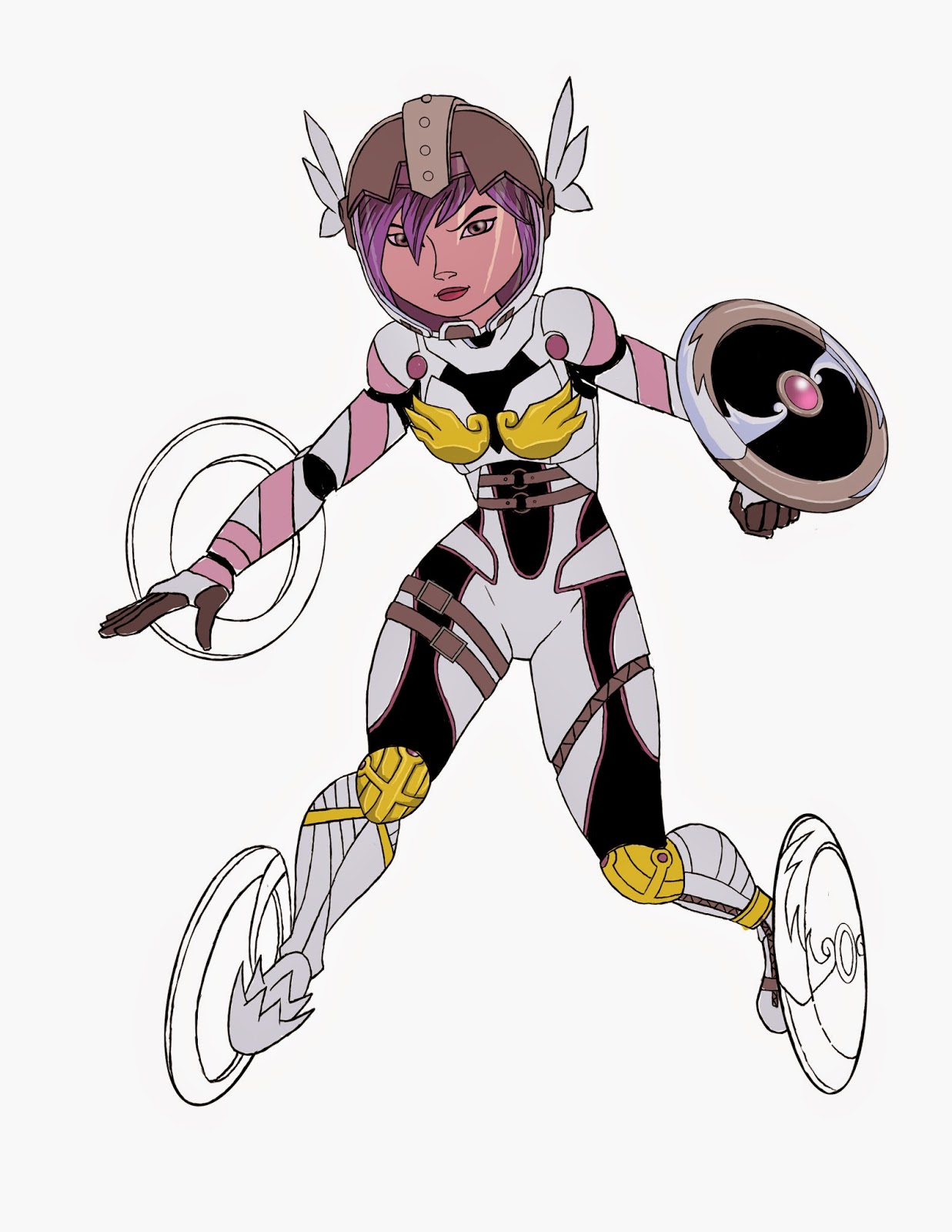
Go-Go: Angewomon Up?
Continuing in my theme of mashups I'm toying with a design combining Big Hero 6's Go Go Tomago & Digimon's Angewomon. Of course Honey Lemon would have been an obvious choice to pair with Angewomon but where's the fun in doing the obvious. The main issue with combining these two characters is that Angewomon's costume is...um...limited, so it's tricky to add aspects of it to Go Go's armor because she can't have skin exposed.
Basic Concept Idea:
~Use the brunt of Go Go's armor as the base.
~Of course Angewomon's...chest plates/armor? Are carrying over.
~The pink stripes around Go Go's arms represent the scarf Angewomon has wrapped around her arms.
~Most likely I'm keeping the belts Angewomon wears.
~Go Go's disks...Instead of giving her the 8 wings Angewomon possesses I'm working on a design for the 4 disks Go Go uses to move that will each have 2 wings plus the Crest of Light on them. That way the wings won't be tacked on to her simple silhouette.
~Go Go's Helmet: Essentially it's been turned into Angewomon's helmet but with the structure & function of Go Go's.
~Her boots are a straight split between the to characters as is the black spandex though the cutouts will not be cutout.
Monday, March 9, 2015
Baymax's New Omnimon/Omegamon Armor
~Big Hero 6: Baymax
~Digimon: Omnimon/Omegamon's armor mixed with aspects of Baymax's red armor.
~Digimon: Digivice = Fusion of both Matt & Tai's digivices
~Baymax's chest plate that gives access to his A.I. now holds a digivice which functions as his power source
Digimon & Disney On The Brain
So...Baymax + Omnimon/Omegamon = OmniBaymax/OmegaBaymax
I don't think this sketch requires too much explaining outside of that formula. I thought Baymax's armor needed more power & of course my first idea was to fuse him with a Digimon.
I don't think this sketch requires too much explaining outside of that formula. I thought Baymax's armor needed more power & of course my first idea was to fuse him with a Digimon.
Wednesday, March 4, 2015
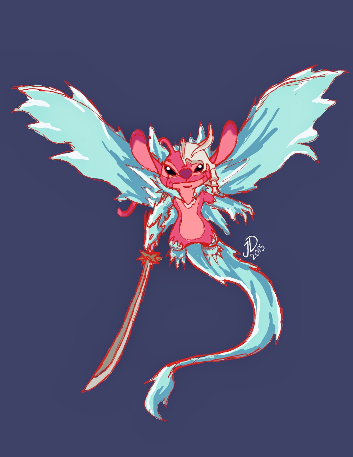
Experiment 624: Soul Reaper Angel
Design Breakdown:
~Lilo & Stitch: Experiment 624, Angel
~Bleach: (Arrancar) Espada #4 Ulquiorra's hollow mask & the teal lines that descend from his eyes.
~Bleach: Captain #10 Toshiba Hitsugaya's Bankai
~Angel finally has her wings & with them she possesses the power to be a Soul Reaping Angel of Death.
Monday, March 2, 2015
Rough Draft of Experiment 624
It's been a while since I've posted the preliminary sketch for a picture, so here is Experiment 624 from Lilo & Stitch. If you noticed she looks a little different from her original appearance...In this version she is using Soul Reaper Tōshirō's Bankai while wearing Espada #4 Ulquiorra's Hollow mask with the teal lines that descend from his eyes. I wanted to make her look a little more intimidating than the Soul Reaper Stitch picture I drew because Angel is one of my favorite Experiments. I decided to use this Bankai since it'd give her wings to go with her name & now she's more like an Angel of Death.
Subscribe to:
Comments (Atom)


